If you want to design a clean, elegant logo that looks professional and luxurious, you don’t need complicated shapes — you can start with just one letter!
In this tutorial, we’ll create a gold logo in Photoshop using basic tools, gradients, and textures.
What You’ll Need
- Adobe Photoshop (or the editor of your choice)
- A basic understanding of layers
- A font you like
- A gold gradient or texture (you can create your own)
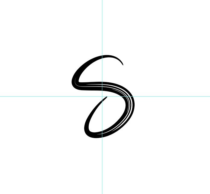
Step 1: Start with a Letter
- Open a new document in Photoshop (a square canvas works well, for example 2000×2000 px).
- Choose the Text Tool (T) and type a single letter — I’ll use S in this example.
- Pick a strong, geometric font (something like Montserrat Extra Bold or Gotham Black).
- Center the letter on the canvas.
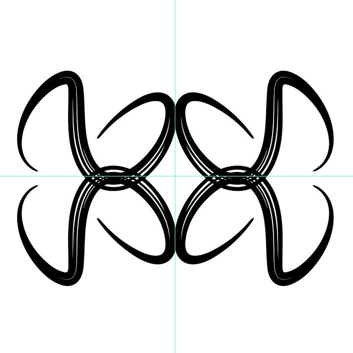
Step 2: Duplicate and Arrange
- Duplicate the “S” layer three times (Ctrl+J / Cmd+J).
- Rotate, flip, and position the letters so they create a balanced, abstract pattern.
- You can use Edit → Transform → Flip Horizontal/Vertical.
- Experiment until you get a shape that feels cohesive — like an emblem or geometric symbol.
- When you’re happy with the composition, merge all the S layers into one and rename it Logo.
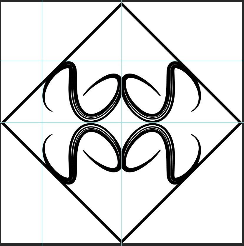
Step 3: Add a Framing Shape
- Select the Rectangle Tool (U) and draw a square around your logo. With no fill, just the stroke
- Rotate the square 45 degrees to make it look like a diamond shape around your logo.
- Adjust the size and position so the composition feels balanced.
- When you are happy with your design, combine all the layer into one.
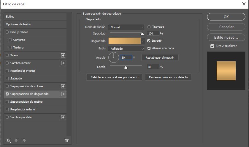
Step 4: Apply the Golden Gradient
To give the logo a luxurious golden look:
- Select the Logo layer. (First we have combined the diamond shape with the S logo)
- Go to Layer → Layer Style → Gradient Overlay.
- Choose a Linear Gradient with these colors:
- Light gold:
#e4bd77 - Dark gold:
#ad8f59
- Light gold:
- Adjust the Angle and Scale until the lighting feels realistic.
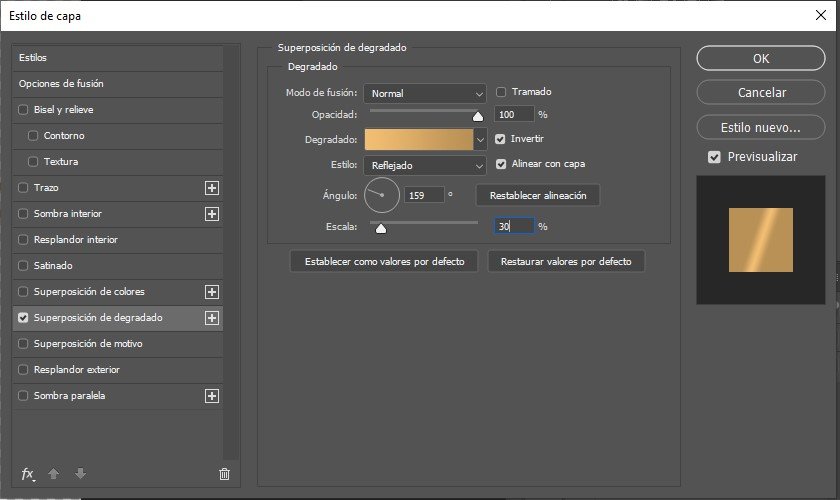
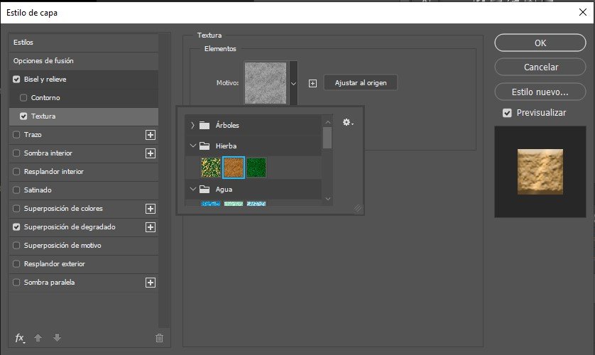
5. (Optional) Add a Texture Overlay on top for a metallic finish — this gives the gold more depth and realism.
Step 5: Add Text
- Use the Text Tool (T) again to type your brand name or initials.
- Apply the same golden gradient and texture style as the logo for visual consistency. But, in this case I have made different adjustments for the gradient.
3. Position the text below or beside the symbol, depending on your preferred layout.
Step 6: Export the Final Logo
Once you’re satisfied with your design, it’s time to export it.
- For transparency: File → Export → PNG (transparent background)
- For presentation: export as JPG on a white or black background.
- Keep a high-resolution version (300 DPI) if you plan to use it in print or mockups.
In the image on the left, you can see the logo without the texture and on a white background. In the image on the right, you can see the result with the texture and a black background.